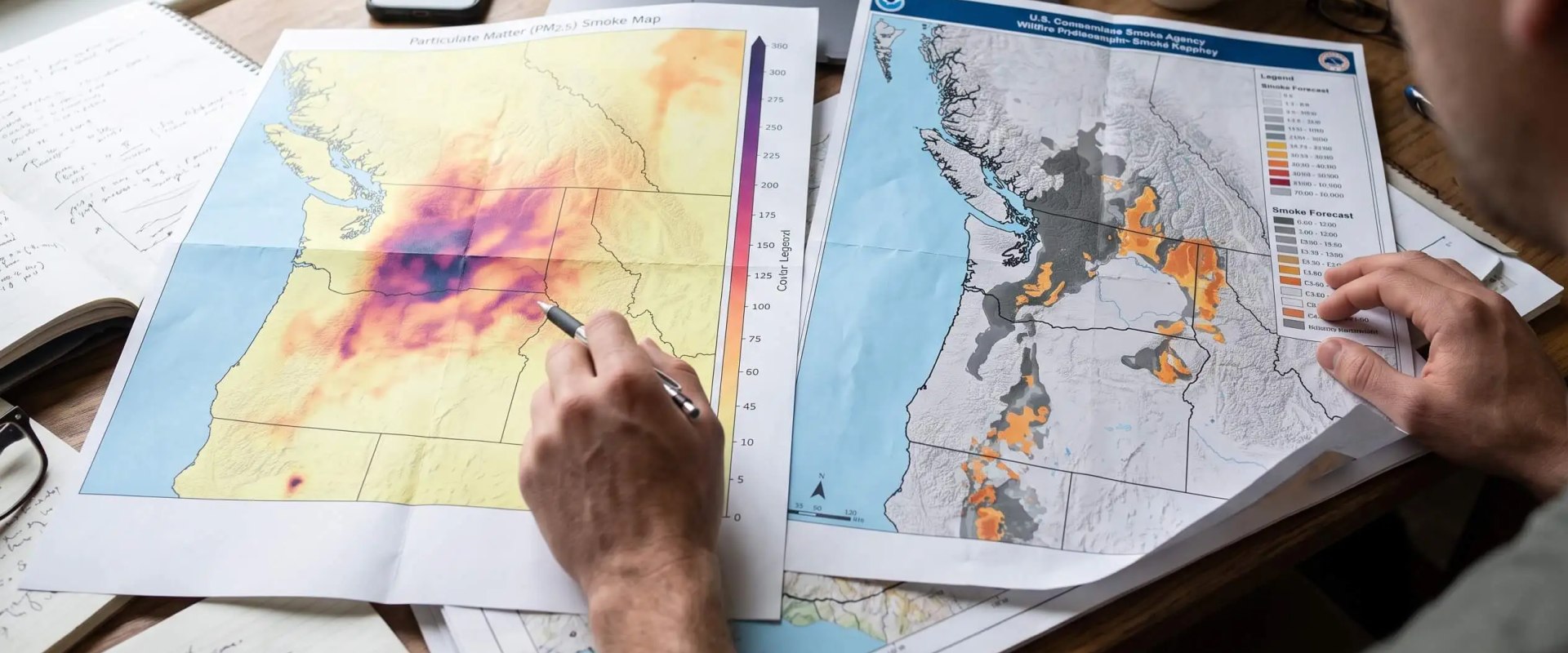
A smoke map can shade your whole county gray while the air monitor down the street glows green, and both can be accurate at the same moment. One is showing smoke in the sky. The other is measuring what you breathe.
This season put that difference to the test. During the 2026 United States wildfire season, the National Interagency Fire Center's count passed 64,000 fires and 9 million acres by mid-October. In July, smoke from Canadian fires drifted over the Great Lakes and down the East Coast, and plenty of families spent those afternoons toggling between apps before cracking a window.
A current wildfire smoke map USA today gives you a clearer picture of where smoke is moving and how it may affect air quality in your area. By comparing satellite smoke plumes, real-time air quality readings, and forecast data, you can better understand local conditions, plan outdoor activities, and make informed decisions to keep your family safe. Five simple checks will help you get the most reliable information from each map.
TL;DR Quick Answers
current wildfire smoke map USA today
For a current wildfire smoke map of the USA today, open a live map that layers active fire points, NOAA satellite smoke plumes, and ground-level AQI on one screen. Check the timestamp first, then let the colored monitor nearest your home guide your plans, since plumes often drift high above breathing level.
Fire Points: Active wildfires from NIFC and WFIGS incident data, plus new detections from the past 24 hours.
Smoke Plumes: NOAA analysts trace these on satellite images about twice a day and label them light, medium, or heavy.
Ground-Level AQI: Monitors and EPA-corrected sensors show the air you actually breathe, refreshed hourly.
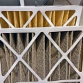
Indoor Action: At AQI 101 or higher, close the windows, switch to recirculate, and run a MERV 13 filter.
Top Takeaways
Ground-level readings drive health decisions. Plumes show smoke overhead, and that smoke may never reach breathing height.
Timing explains most gaps. NowCast averages and twice-daily plume analyses run on different clocks.
Corrections matter. Turn on EPA-corrected sensor data before you compare it with official monitors.
Compare like with like. Match the source, time, metric, settings, and location.
Act indoors once both maps agree. Recirculate, run the fan, and use MERV 13 where your system allows it.
Why Two Wildfire Smoke Maps Rarely Agree
Most disagreements come down to how each map gets built. Four differences do most of the damage.
Satellite Plumes vs. Ground-Level Sensors
NOAA analysts draw the gray shading you see on most smoke maps. In the Hazard Mapping System, they trace smoke on satellite images and label each plume light, medium, or heavy. A plume tells you smoke sits somewhere in the air column above you. It can't tell you how high. Clouds can hide smoke altogether, and NOAA itself tells users to check plume data against other sources before acting on it. For health decisions, I lean on the colored circles instead, because monitors and sensors near the ground produce those readings at the height your family breathes.
NowCast Averages vs. Live Readings
AirNow reports official air quality as the NowCast AQI. The formula weights the past 12 hours of monitor data and leans harder on recent hours when conditions shift fast. Even so, it trails a quick-moving plume. When smoke rolls in, a map showing raw hourly or minute-by-minute readings can look worse than AirNow for an hour or two, and the gap flips the other way as the smoke clears.
Corrected vs. Raw Sensor Data
Low-cost sensors like PurpleAir tend to read high in wildfire smoke, and many average over shorter windows. The AirNow Fire and Smoke Map corrects for both. It applies an EPA adjustment and averages sensor data to the hour, which brings the numbers in line with regulatory monitors. That's why the same sensor on the same rooftop can give you two different readings, depending on which map you open.
Observed vs. Forecast Layers
Many trackers mix what satellites already saw with model forecasts of where smoke is headed, such as NOAA's HRRR-Smoke. An observed layer and a 48-hour forecast can look nothing alike. Check which one you've switched on before comparing.
How to Compare Two Wildfire Smoke Maps in Five Steps
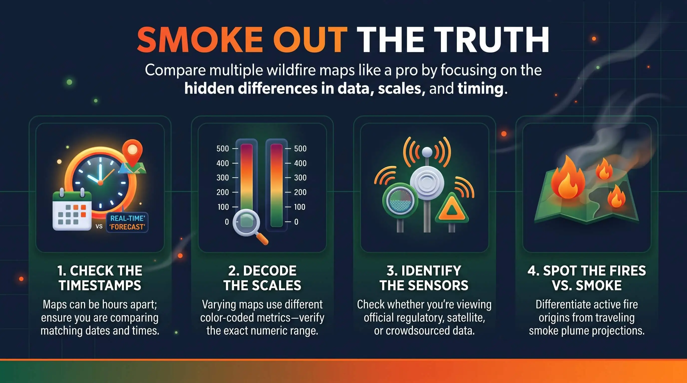
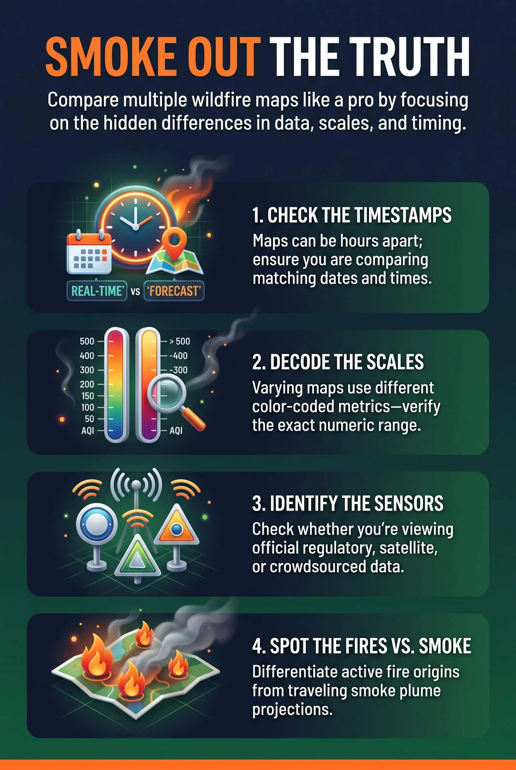
Work through these in order, and most disagreements sort themselves out before you reach the end.
Read the source label. Find out whether you're looking at satellite plumes, regulatory monitors, low-cost sensors, or a model forecast. The legend or footer usually says.
Match the timestamp. NOAA usually posts its first daily smoke analysis between 11 a.m. and noon Eastern and a second one between 7 and 8 p.m. Line up the same hour and time zone on both maps.
Match the metric. Plume density, AQI, and PM2.5 in µg/m³ measure different things. A popup that reads 40 could be a concentration or an index value, so check the label before you compare numbers.
Check correction and averaging settings. On sensor maps, turn on the US EPA conversion so readings track with official monitors.
Zoom to the same spot. Compare the monitor or sensor closest to your home rather than a regional wash of color.
Still seeing two different stories? Let regulatory monitors and the AirNow Fire and Smoke Map guide your health decisions, and use a nearby corrected sensor to time things block by block. A high quality filter can also help capture fine particles from wildfire smoke and keep your indoor air cleaner when outdoor air quality declines.
Where to Find a Current Wildfire Smoke Map for the USA Today
A combined map cuts out most of the tab-switching. Look for one that stacks federal fire points, observed and forecast NOAA smoke plumes, and an AQI layer on a single screen. The live U.S. map at the top of the resources below pulls WFIGS and NIFC fire data together with NOAA smoke analysis, so each fire and the smoke it's throwing off sit right next to your air quality reading. On the AirNow Fire and Smoke Map, plumes start out hidden. Tap the settings icon and switch on "NOAA Smoke Plumes" to bring them up. You can also test indoor air quality to check whether outdoor wildfire smoke is affecting the air inside your home.
Common Misreadings to Avoid
"A gray plume means bad air outside my door." Plumes often ride thousands of feet up, well above breathing height.
"No plume means clean air." Darkness and cloud cover hide smoke from satellites, and fine particles can hang around after the haze lifts.
"One red sensor means my whole area is unhealthy." That outlier might sit indoors, carry the wrong label, or be failing. Check its neighbors first.
"Every AQI spike is smoke." Ozone can drive the number on summer afternoons, so look at the listed pollutant.
What to Do Indoors When Both Maps Show Smoke
Don't take your indoor air for granted when both maps agree on orange or worse. Fine particles work their way in through gaps and fresh-air intakes, even with every window shut. Here's exactly what to do:
Close windows and doors, then shut any outdoor air intake so your system recirculates the air already inside.
Switch the thermostat fan from "Auto" to "On" to keep air moving through the filter.
Run a MERV 8 filter, or the highest rating your system can handle, as the EPA recommends for smoke.
Set up one clean-air room with a portable HEPA air cleaner sized for the space.
Check the filter every week or two during long smoke events, and swap it once it turns gray or airflow drops.
Pro Tip: Keep a spare MERV 13 filter on the shelf before fire season starts. Once both maps agree the smoke has reached ground level, you can swap it in that same hour instead of waiting on a delivery.
"Through multi-day smoke events, I've found that two maps disagree because of timing far more often than bad data. A satellite plume traced at midday and a NowCast reading built on 12 hours of monitor data describe different moments, so I line up the timestamps before I trust either one."
7 Essential Resources
Live USA Wildfire and Smoke Map: Active fires, observed and forecast smoke plumes, and an AQI layer on one screen, with indoor smoke tips alongside.
AirNow: How To Use the Fire and Smoke Map: The official walkthrough for monitor circles, sensor icons, and the NOAA plume toggle.
NOAA Hazard Mapping System Fire and Smoke Product: Where the satellite plume data comes from, when it updates, and what it can miss.
National Interagency Fire Center: National Fire News: Year-to-date fire counts, acreage, and current national fire activity.
CDC: Safety Guidelines for Wildfires and Wildfire Smoke: Respirator advice, clean-air rooms, and HVAC settings for smoky days.
U.S. Forest Service: Research to Help You Breathe a Little Easier: How air resource advisors and the BlueSky framework build the smoke outlooks you see on official maps.
National Weather Service: Wildfire Weather-Ready Guidance: Smoke safety basics, Red Flag Warnings, and hour-by-hour smoke forecasts.
3 Supporting Statistics
Researchers at the EPA found that roughly 1 in 5 county-level smoke days identified from surface data had no satellite plume overhead, and they tie that gap to cloud cover hiding the smoke. EPA NCEE Working Paper 26-02
When researchers compared NOAA plume data with hourly airport observations from 2010 to 2020, they found a weak correlation (r = 0.17) with light plumes counted, rising to r = 0.60 for medium and heavy plumes alone. ESS Open Archive Study on HMS Smoke and Airport Data
Across 19 days of Canadian wildfire smoke in 2023, asthma-associated emergency department visits in the U.S. ran 17% higher than expected. PubMed Central: MMWR Report on Asthma ED Visits
Research shows that wildfire smoke can affect air quality even when satellite maps show no visible plume, while differences between monitoring methods can make smoke levels harder to interpret. With asthma-related emergency visits rising 17% during major smoke events, checking reliable wildfire smoke maps and using high quality filters indoors can help reduce exposure to harmful airborne particles.
Final Thoughts and Opinion
Here's my honest opinion. When two smoke maps disagree, that rarely means either one is wrong. The plume layer shows where smoke sits in the sky, while ground monitors show what's reaching your lungs and the forecast layer looks ahead. Once you stop waiting for them to match and start asking which question each map answers, the confusion clears up fast. I'd rather see someone understand why two maps differ than trust one blindly. And the part that protects your family still happens inside your house, with the windows closed and a filter built for fine particles doing the work while the fan runs. That's where you get to be the hero of your household. Choosing a pleated furnace filter with an appropriate MERV rating can help capture fine particles from wildfire smoke and improve the air your family breathes indoors.
Frequently Asked Questions
Which Wildfire Smoke Map Is Most Accurate for Health Decisions?
The AirNow Fire and Smoke Map, because it pulls permanent monitors, temporary smoke monitors, and EPA-corrected sensors into one view. Use plume maps for context and a nearby corrected sensor for timing.
Does a Gray Smoke Plume Mean the Air Is Unhealthy Where I Live?
Not necessarily. A plume shows smoke anywhere in the air column, often thousands of feet up. Check the nearest ground-level monitor before you change your plans.
Why Does PurpleAir Read Higher Than AirNow During Smoke?
Raw readings from low-cost sensors tend to run high in smoke, and they use shorter averages. Turn on the US EPA conversion to bring them closer to official monitors.
How Often Do Wildfire Smoke Maps Update?
Monitors and sensors refresh hourly or faster. NOAA posts its plume analysis about twice a day, late morning and evening Eastern time, once analysts finish their review.
What AQI Level Should Change My Plans on a Smoky Day?
At 101, people in sensitive groups should cut back on time outdoors. At 151 and above, everyone should, and that's the point to focus on keeping indoor air clean.
Why Can I Smell Smoke When the Map Shows No Plume?
Night, cloud cover, or smoke trapped close to the ground can hide it from satellites. Check your nearest monitor and any local advisories.
Compare Your Smoke Maps With Confidence
Two smoke maps that seemed to argue usually agree once you line up the source, the timestamp, and the metric. Keep a reliable live map bookmarked, let the ground monitor nearest your home guide your next move, and give your indoor air the filtration it needs. If you're considering air ionizer installation as an additional air-cleaning option, choose a system certified to produce no ozone to avoid introducing another indoor air pollutant.